
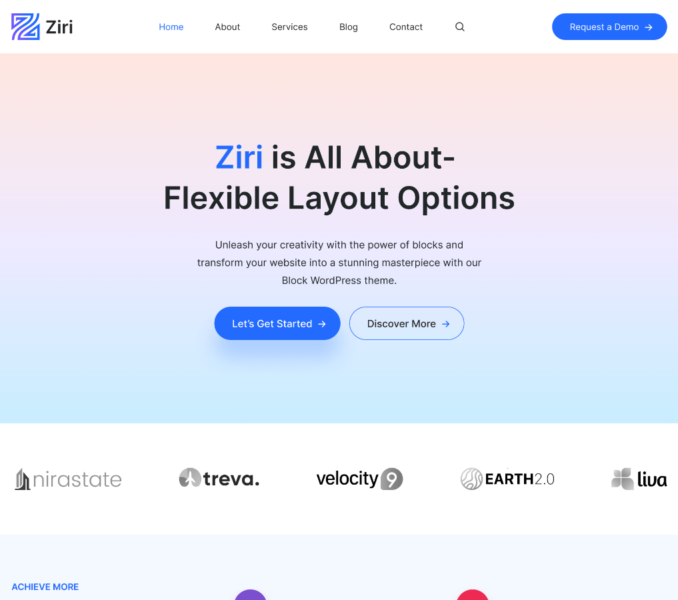
Blocks provided by the WordPress editor is an essential when it comes to the formation of different patterns and templates in the Ziri theme.
Considering their significance, the Ziri theme has provided a Styles setting option for different WordPress Blocks inside their respective settings.
For instance, the Styles setting provided for the Group Block.
You can apply hover effect for a specific Group created inside a Page Template via this setting.
The Style setting will appear for a Group when you select a particular Group inside the Site Editor or the Page Template Editor.
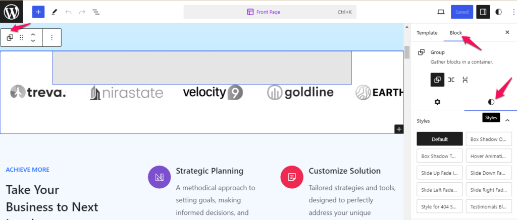
The following are the different hover effect options provided under the Styles setting:
Default: Selecting this option won’t apply any styling to the selected Group.
Box Shadow One: A box shadow effect of type one gets applied to the Group on hover when you select this option.
Box Shadow Two: : A box shadow effect of type two gets applied to the Group on hover when you select this option.
Hover Animation: You can apply animation effect to the selected Group on hover state by selecting this option.
Slide Up In Fade Animation: You can apply slide up animation to the selected Group by selecting this option.
Slide Down in Fade Animation: You can apply slide down animation to the selected Group by selection this option.
Slide Right in Fade Animation: You can apply slide right animation to the selected Group by selection this option.
Slide Left in Fade Animation: You can apply slide left animation to the selected Group by selection this option.
Style for 404 Search: This option allows you to customize the appearance of a 404 error page by implementing custom CSS code.
Testimonials Blocquote: This option allows you to add Blockquote that enclosed text in an extended quotation.
You can also find different Style Settings for Button Block.
The Style setting will appear for a Button when you select a particular Button inside the Site Editor or the Page Template Editor.
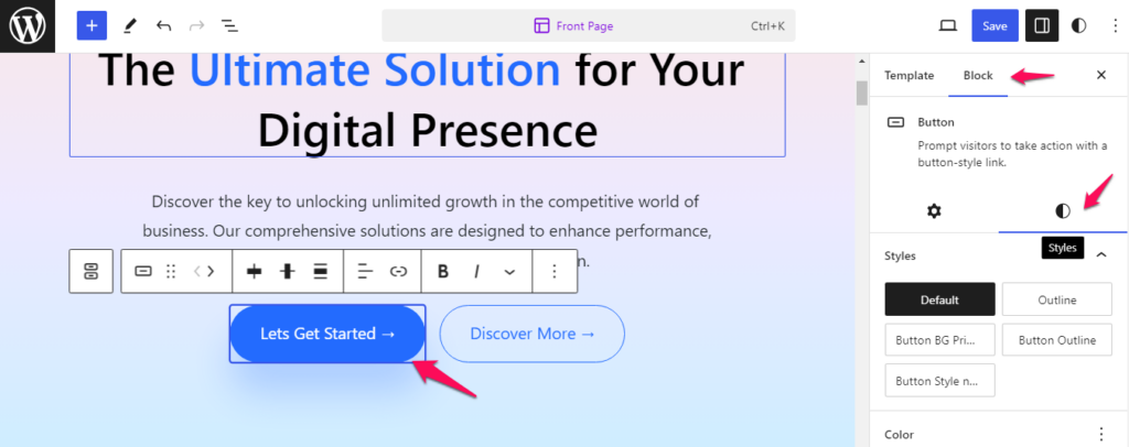
The following are the different styles provided under the Styles setting:
Default: Selecting this option will apply default styling to the Selected Button.
Outline: This option allows you to add a button with the box-shadow property and white background color.
Button BG Primary: This option allows you to incorporate a button with a primary-colored background.
Button Outline: This option allows you to add button with an outlined appearance.
Button Style no Background: This option allows you to add button with no background and underline text.